
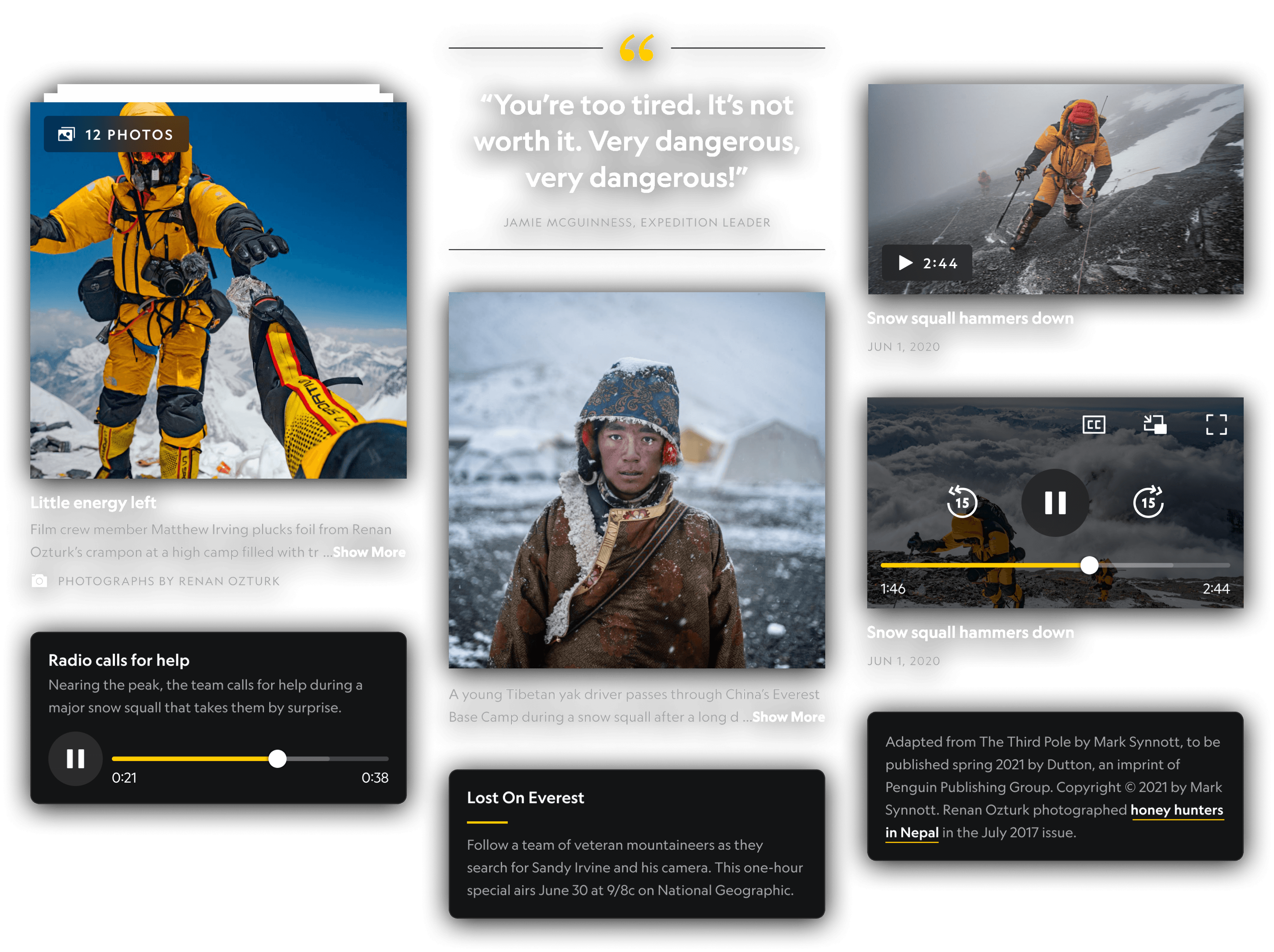
National Geographic
National Geographic App Redesign
I had the opportunity to contribute to the high priority redesign of the National Geographic app, leading key components of the effort. The app received a complete makeover and platform rewrite from the ground up, motivated by user feedback and techncial business needs.
Company
The Walt Disney Company
Line of Business
National Geographic
Product
National Geographic App
Role
UI Design, UX Design, Icon Design, Design Systems
National Geographic
National Geographic App Redesign
I had the opportunity to contribute to the high priority redesign of the National Geographic app, leading key components of the effort. The app received a complete makeover and platform rewrite from the ground up, motivated by user feedback and techncial business needs.
Company
The Walt Disney Company
Line of Business
National Geographic
Product
National Geographic App
Role
UI Design, UX Design, Icon Design, Design Systems

The Why
The redesign of the National Geographic app was a high priority project for Disney, motivated by numerous factors.
The Why
The redesign of the National Geographic app was a high priority project for Disney, motivated by numerous factors.
Platform migration
The driving force behind the project. National Geographic was aquired by Disney through the acquisition of their parent company, 20th Century Fox. To avoid the app going dark, it had to be migrated off 20th Century Fox's platform and rebuilt on Disney’s, requiring a complete rewrite of the app.
Poor 1.6 star app rating
App Store ratings were at an unacceptable level, hovering around 1.5 stars
Poor 1.6 star app rating
App Store ratings were at an unacceptable level, hovering around 1.5 stars
User feedback
Substantial user feedback requesting saving and downloading content.
User feedback
Substantial user feedback requesting saving and downloading content.
Dark mode support
Dark mode support is more than a stylistic preference. It's an accessibility requirement.
Dark mode support
Dark mode support is more than a stylistic preference. It's an accessibility requirement.
COVID pandemic
An opportune time to elevate the app when people were looking for entertainment.
COVID pandemic
An opportune time to elevate the app when people were looking for entertainment.
Yikes 😬

The Opportunity
With the required platform migration, our team took advantage of the unique opportunity to redesign the app from the ground up and address user feedback.
The Opportunity
With the required platform migration, our team took advantage of the unique opportunity to redesign the app from the ground up and address user feedback.
Complete redesign the app from the ground up
Complete redesign the app from the ground up
Address major user feedback & concerns
Address major user feedback & concerns
Added support to save content
Added support to save content
Added support to download content to device
Added support to download content to device
Elevate the visual design
Elevate the visual design
Improve the user experience
Improve the user experience
Dark mode support
Dark mode support
Showcase Nat Geo's high quality content better
Showcase Nat Geo's high quality content better
Project Scope
The scope of work was large and the timeline was not, so efficient collaboration and division of work was key.
Our team laid out the scope of work and divided it amongst our team of designers. Heavy collaboration was maintained across our areas of ownership to ensure parity.
Project Scope
The scope of work was large and the timeline was not, so efficient collaboration and division of work was key.
Our team laid out the scope of work and divided it amongst our team of designers. Heavy collaboration was maintained across our areas of ownership to ensure parity.
=
My assigned responsibilities
Home
Article
Entity Page
Magazine
Paywall
Search
Settings
Video Player
Photo Viewer
Design System
Home Screen


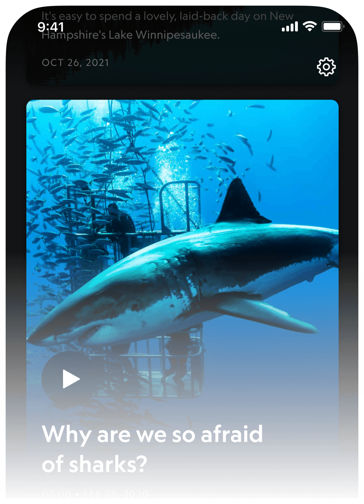
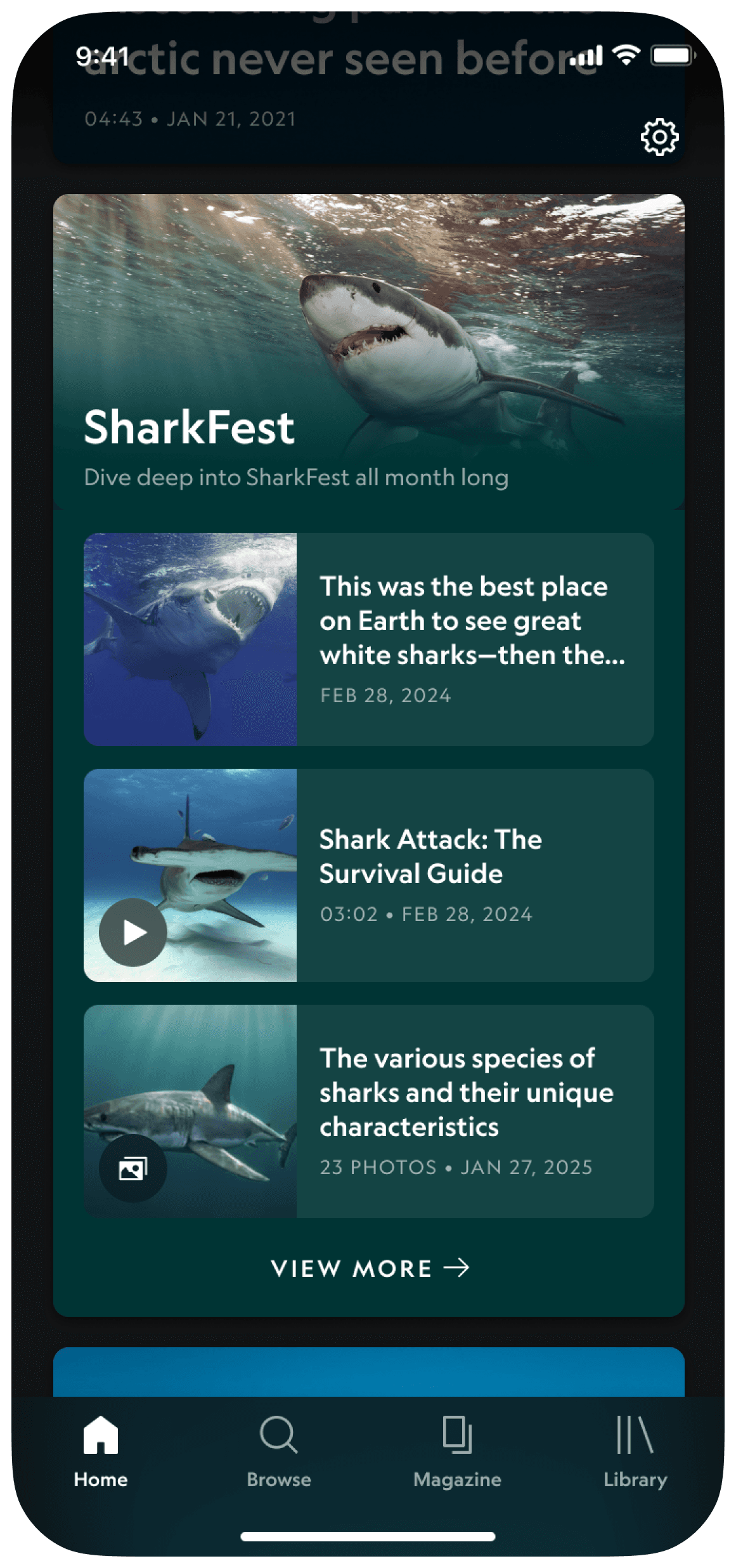
Home Screen Painpoints
The Home screen is the readers first impression & there were some clear areas for improvement.
Home Screen Painpoints
The Home screen is the readers first impression & there were some clear areas for improvement.
Segmented content tabs were not valuable
Segmented content tabs were not valuable
Lacking visual impact
Lacking visual impact
Lack of clarify around what is premium magazine content
Lack of clarify around what is premium magazine content
No dark mode support
No dark mode support

Old Design
Goals & Opportunities
We have some of the worlds best photography & video content at our disposal. Let's take advantage of that.
Goals & Opportunities
We have some of the worlds best photography & video content at our disposal. Let's take advantage of that.
Eliminate the segmented tabs of content
Eliminate the segmented tabs of content
Showcase Nat Geo's famous photography
Showcase Nat Geo's famous photography
Larger, more immersive content cards
Larger, more immersive content cards
Account for article, photo and video content types
Account for article, photo and video content types
Better clarify which content is premium content for Magazine subscribers
Better clarify which content is premium content for Magazine subscribers
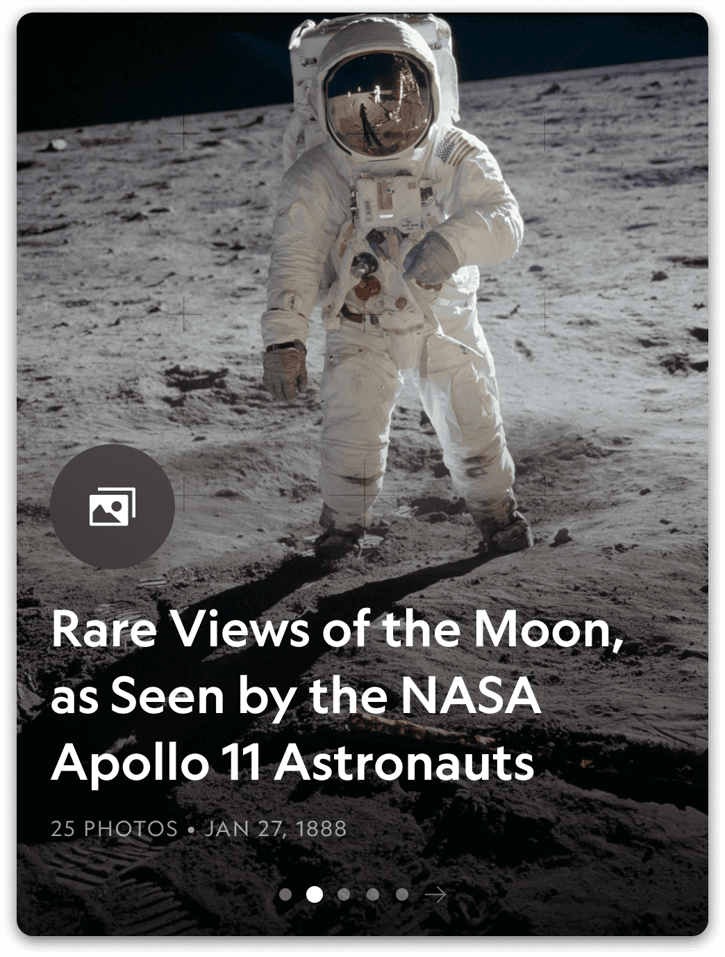
An immersive, uniform and flexible home card structure that supports various content types
In an effort to better showcase Nat Geo's famed photography, I used an immsersive 3:4 aspect ratio card with edge-to-edge photography. This design flexed to various content types with ease.
An immersive, uniform and flexible home card structure that supports various content types
In an effort to better showcase Nat Geo's famed photography, I used an immsersive 3:4 aspect ratio card with edge-to-edge photography. This design flexed to various content types with ease.

1
2
1
2
1
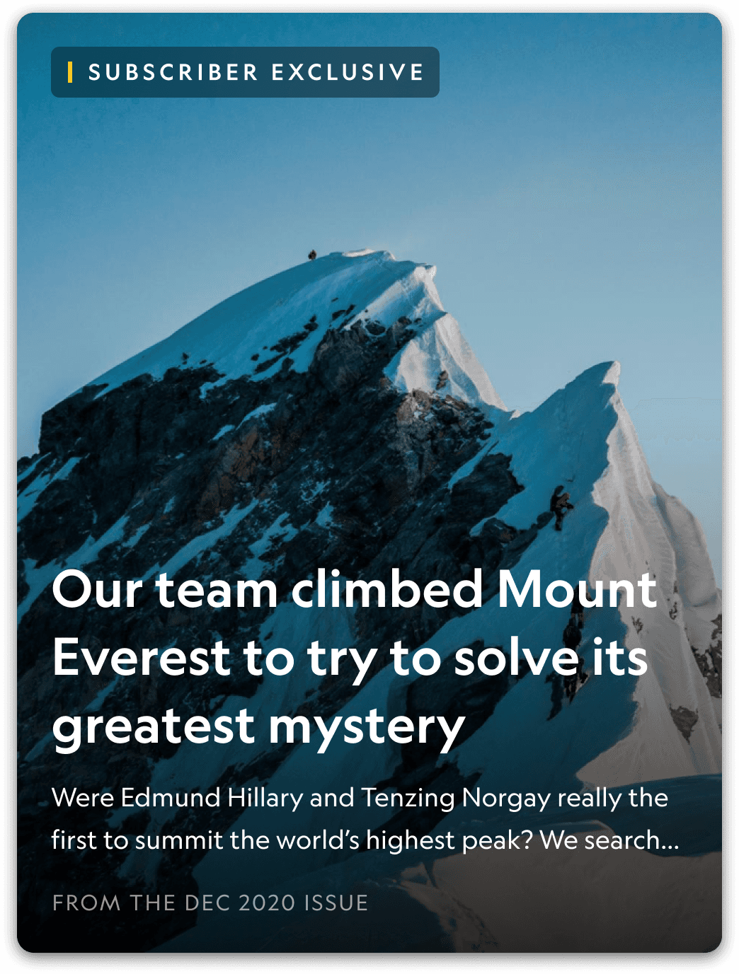
Subscriber Exclusive
The app had a mix of free and subscription based Magazine content but the home feed failed to clearly distinguish which content cards were for paying subscribers. It was my responsibility to come up with a solution that was clear, elegant and Nat Geo branded.
1
Subscriber Exclusive
The app had a mix of free and subscription based Magazine content but the home feed failed to clearly distinguish which content cards were for paying subscribers. It was my responsibility to come up with a solution that was clear, elegant and Nat Geo branded.
2
Media badges
The home screen was curated with articles, photos, photo galleries and videos. The challenge was establishing clear distinction between those various content types. The solution myself and the team landed on was media badges that contained icons I designed using common visual metaphors.

Article

Photo
Photo Gallery
Video
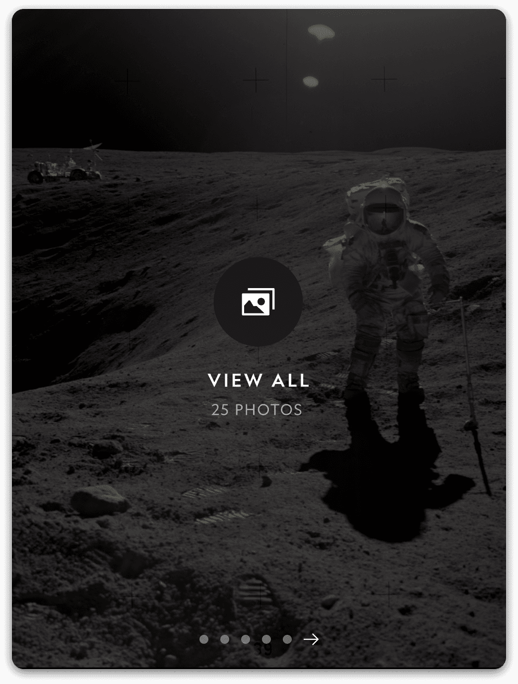
Encouraging deeper exploration into galleries
In an effort to create more distinction between cards and encourage deeper exploration, the reader can swipe through the first 5 photographs of the gallery. From that point, they have the choice to dive into the full gallery in the photo viewer.
Encouraging deeper exploration into galleries
In an effort to create more distinction between cards and encourage deeper exploration, the reader can swipe through the first 5 photographs of the gallery. From that point, they have the choice to dive into the full gallery in the photo viewer.


Articles


Article Painpoints
Articles were missing key features readers were expecting & that competitors were offering
Article Painpoints
Articles were missing key features readers were expecting & that competitors were offering
No ability to save articles
No ability to save articles
No ability to download articles for offline reading
No ability to download articles for offline reading
Lack of clarity between a single photo and a photo gallery
Lack of clarity between a single photo and a photo gallery
No dark mode support
No dark mode support
Goals & Opportunities
Saving & downloading articles was important, but more opportunities presented themselves
Goals & Opportunities
Saving & downloading articles was important, but more opportunities presented themselves
Integrate saving & downloading to the new "Library" feature
Integrate saving & downloading to the new "Library" feature
Create clearer distinction between inline article media types
Create clearer distinction between inline article media types
Support dark mode
Support dark mode
Elevate design language & immersiveness
Elevate design language & immersiveness
Saving & Downloading
Save your favorites and read whenever or wherever you want
Overwhelming feedback from readers requested the ability to bookmark content. In addition, downloading articles to the device was important for many readers when internet was not available, like an airplane flight.
Saving & Downloading
Save your favorites and read whenever or wherever you want
Overwhelming feedback from readers requested the ability to bookmark content. In addition, downloading articles to the device was important for many readers when internet was not available, like an airplane flight.

Save
Simply bookmarks the article to your library for future reference. Will not be available offline.
Save
Simply bookmarks the article to your library for future reference. Will not be available offline.
Download
Saves & downloads the article and all of its content to your device for offline viewing.
Download
Saves & downloads the article and all of its content to your device for offline viewing.
Article Lead
Beautiful, systematized article leads
Again, with the goal to showcase Nat Geo photography as much as possible, I created a system of layers and effects that creates a harmonious background utilizing the hero image.
Article Lead
Beautiful, systematized article leads
Again, with the goal to showcase Nat Geo photography as much as possible, I created a system of layers and effects that creates a harmonious background utilizing the hero image.

Inline Article Media
Supporting editorial needs with inline article components
I had to account for a number of inline article components ranging from pull quotes, single photos, photo galleries, video, audio clips and editorial notes.
Inline Article Media
Supporting editorial needs with inline article components
I had to account for a number of inline article components ranging from pull quotes, single photos, photo galleries, video, audio clips and editorial notes.
Design System
I contributed heavily to our design system and component libraries, while our design team maintained frequent collaboration throughout the duration of the project.
Iconography
The existing icon set was outdated, lacked polish and visual consistency.
As our app redesign progressed, it became obvious the legacy icon set was outdated and not aligning with the new design language. I spearheaded the effort, convincing leadership it was crucial to elevate our icon set to match the elgance of our new UI.
Simplify artwork
Simplify artwork
Use better visual metaphors
Use better visual metaphors
Improve consistency
Improve consistency
Improve legibility
Improve legibility

Old app

Working within a structured grid guaranteed uniformity across the icon library
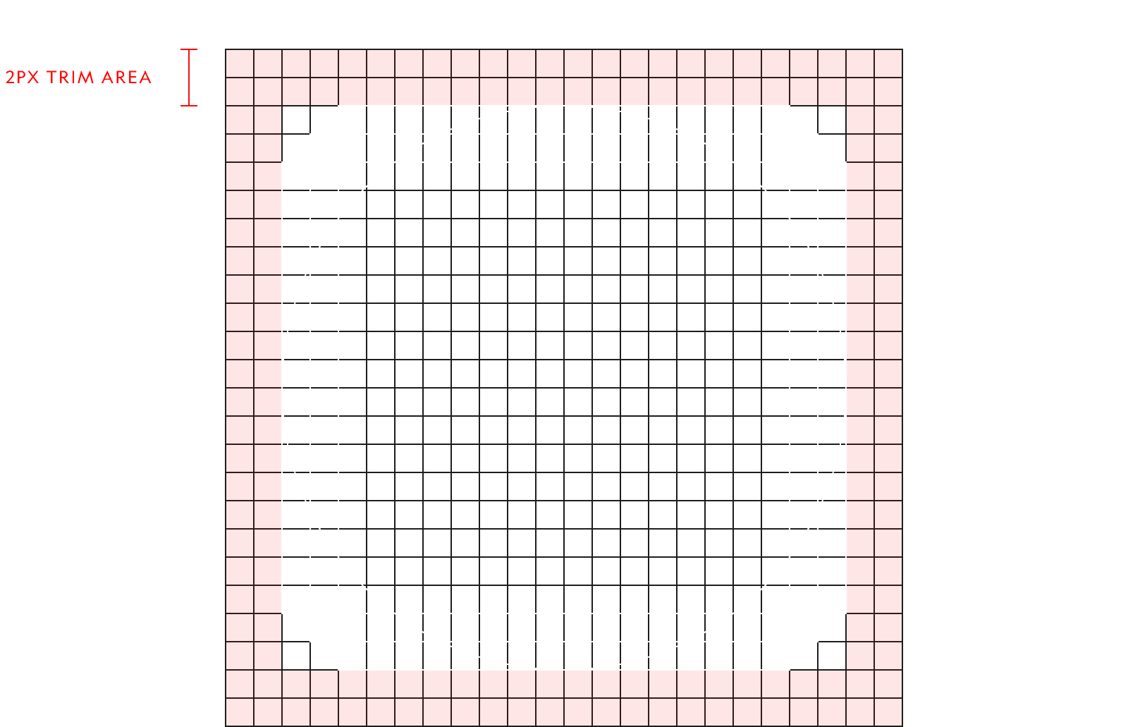
24x24 pixel grid
Designed at the most common icon size in the UI, 24x24 pixels. This serves as the foundation to the icon set and what the keyline shapes are based off of.
24x24 pixel grid
Designed at the most common icon size in the UI, 24x24 pixels. This serves as the foundation to the icon set and what the keyline shapes are based off of.
Keyline shapes
Using keyline shapes for each icon ensured consistency and balanced visual weight for icons of various types.
Keyline shapes
Using keyline shapes for each icon ensured consistency and balanced visual weight for icons of various types.

Component Libraries
Reusable components at scale ensured a cohesive system & efficient engineering collaboration.
Each component was cataloged in libraries with detailed specs and usage guidelines that allowed for efficient collaboration across designers and engineers.
Component Libraries
Reusable components at scale ensured a cohesive system & efficient engineering collaboration.
Each component was cataloged in libraries with detailed specs and usage guidelines that allowed for efficient collaboration across designers and engineers.


Impact
A win-win for the readers & the business.
Impact
A win-win for the readers & the business.
Improved App Store Rating
1.6
Before
4.9
After
